Client
Airbnb
Audience
Internationl masses; traveling enthusiasts
Category
Branding design / Identity
Graphic design
Using a combination of paradoxical, equivocal and ambiguous text (in a neutral san-serif), the festival aims to deceive its attendees. Only by reading deeper and examining witty footnotes (in an academic serif) scattered across the deliverables can one finally decipher the true meaning of the text.
With that said, attendees are not thrown into the festival without any help. The festival comes with a series of rules that can be found on its key promotional material. These rules, cleverly written to guide festival attendees, are as follows:
1. In black we trust.
2. Read everything with great care.
3. Your instincts are usually right.
4. All things be done in moderation.
5. Obtain the festival programme as soon as
possible.
I’ll ask once and only once: Do you solemnly swear that you will tell the truth, the whole truth, and nothing but the truth?
The 2016 Edition of Singapore Writers Festival examines the veracity of truths, reviewing the persuasions found in writing whilst also asking pertinent questions about the value of faith and skepticism.
This SWF, we investigate the unreliable narrator across literary fiction and poetry, taking a closer look at the role of misdirection and equivocation in deception and crafting character bias. In non- fiction, we navigate the political landscape, dissecting history and propaganda, discussing
the validity of opinion and the possibility of absolute law and justice. The theme also prompts us to explore darker issues of Narcissism, Machiavellianism and Psychopathy, encouraging us to look within to find answers about why some of us have a desire to deceive.
Finally, the prospect embodied in the theme also points to the mood of ambiguity, imploring us as recipients of persuasion to hone our mind and senses, to shake off society’s shroud of indolence and look beyond the surface to derive the deeper meaning hidden in layers of obscurity. To view the world with complete lucidity, live with great moral integrity and be infallible in the face of mendacity.


Project
Synopsis

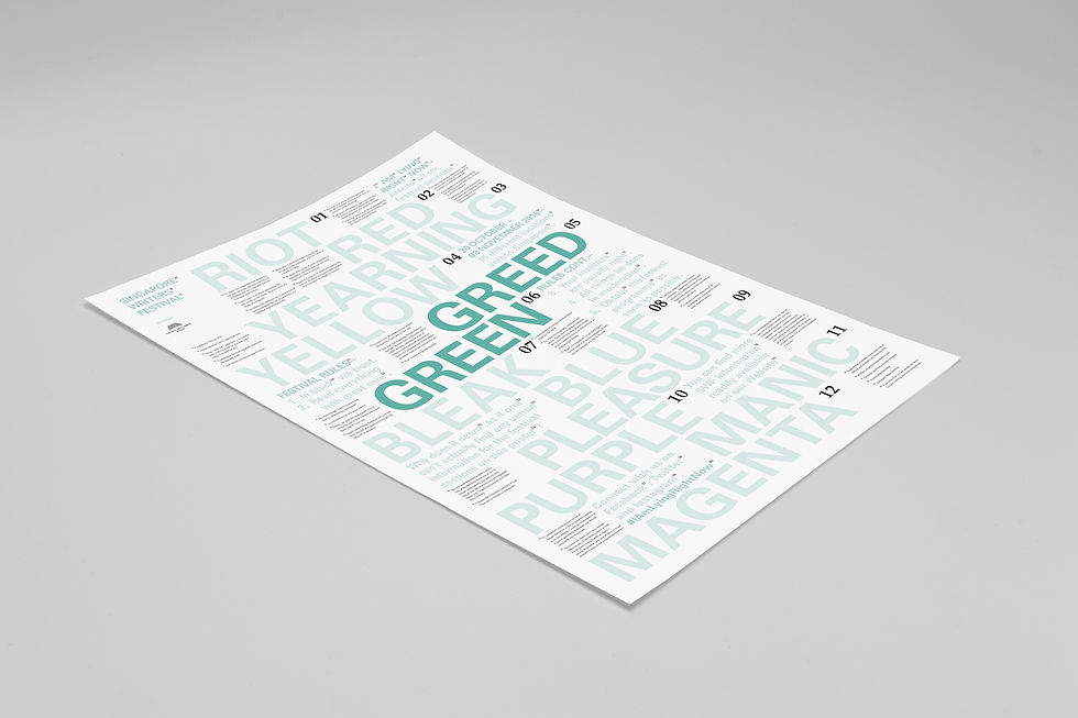
These are the events posters. There is a dedicated one for each section. The sections are all based on colours as represented. Only the colours are edited and changed in this case. In addition there is a general poster that ties everything together; it is designed in grey to exude the neutrality amongst the rest of the sections as they are have so much more character.


These are the festival passes that will be used for the event. The two designs are inverted, white on black and black on white. They represent the volunteer pass and the festival pass repectively.
It carries forth the styling of the footnotes and the concept of trusting black all the time.
These are the festival tickets itself, for actual admission for the event. The tickets are different on each of its sides. They are designed with the purpose and concept of a ticket in mind.
Caption
" Please purchase your tickets before entering "
" You can purhcase yout tickets on the inside "


This is the programme booklet. It allows the audiences to know more about each of the events, workshops, talks and even the speakers present.
The entire publication contains the footnotes that guides participants to the minor details and extra information about each of the sections.

A bookmark that is a paradox on both sides. It helps readers to read clearly as it magnifies text.

Buttons for the event, it has words that are known as homonyms printed on them, with thw meaning surrounding it.

These are labels that will be present at the merch stand tables. They have the price of the items. The short description shows the paradox of donating.


Festival t shirt design for people to don and and for volunteers or staff to wear it during service.


Notebook, which is designed with square grids on the content pages inside.


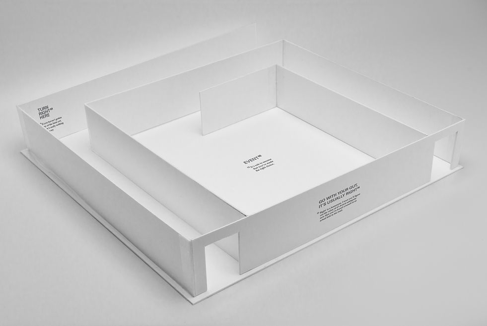
This a wayfinding mock up that is made to visualise and propose how the physcial space would be like when the actual events comes around (SWF 2016). The words and text are all present to create doubt and tension for the event.
The promotional showreel for this project.